A pulse survey measures the state of your organization on a short cycle — monthly, for example — so you can see problems while they are still fixable. COCKPITOS measures across six axes. This guide explains why six, what each axis means, and — most importantly — how to read the scores at the group level and what to do about them.
A pulse survey that reduces everything to a single "engagement score" is easy to run and easy to misread. The independent measurement of six axes is what lets HR pinpoint where a problem lives instead of just knowing that something is off.
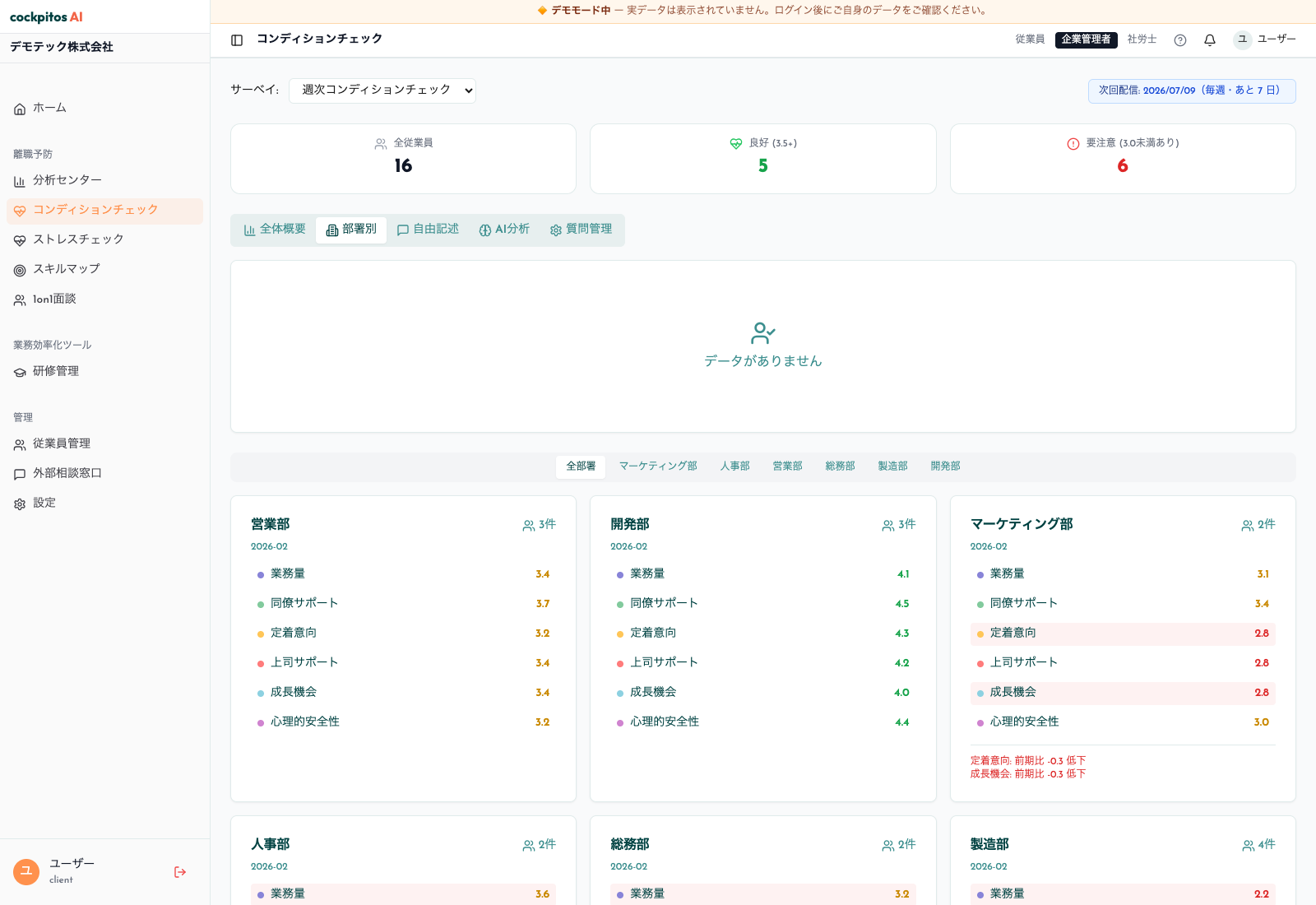
The COCKPITOS pulse survey "condition check" screen shows aggregate response status and team-level trends (sample data from a demo environment).
A note on anonymity — read this first
Everything in this guide is framed at the group level, and that is deliberate.
COCKPITOS pulse surveys are anonymous by design: responses store no user ID or employee ID. There is no individual scoring, no "this person is at risk" flag, and no way to link a pulse response back to a named employee. Analysis happens by segment — department, role, tenure band, location — never per person.
This matters for two reasons:
- Honesty. Employees answer candidly only when they trust that answers cannot be traced back to them. The moment a survey feels like it could be individually attributed, the data degrades.
- Compliance. Japan's stress check system (Industrial Safety and Health Act, Article 66-10) prohibits employers from accessing individual stress check results. Pulse surveys are a separate, voluntary instrument — but the same principle of protecting the individual applies. Never combine an individual's stress check result with pulse data, and never use pulse data to predict a specific person's resignation. Group-level reading is the correct and legal frame.
Keep this in mind throughout: when this guide says a score "drops," it means a segment's aggregate score drops.
1. Why Six Axes?
1.1 The limits of a single number
Ask only "How satisfied are you with your work?" and you run into three problems:
- Variance is too high. An employee whose workload and relationships are both poor lands on the same score as one whose workload alone is poor. The number blurs distinct problems together.
- It doesn't point to an action. "Satisfaction is low" tells you nothing about what to change.
- Cultural bias. In Japanese workplaces, respondents tend toward the middle of a scale (a 3 out of 5). A single blended score flattens into that middle and hides the real signal.
1.2 Where the six axes come from
The six axes are drawn from established workplace research — notably the Job Demands–Resources (JD-R) model — combined with what actually moves in real deployments:
- Workload — the load of the job itself
- Peer support — horizontal relationships
- Manager support — the vertical relationship with a direct manager
- Growth — career and learning opportunity
- Psychological safety — the safety to speak up and to fail
- Retention intent — the intent to stay
The point of independence: any one axis can deteriorate while the others stay healthy. Because that happens constantly in real organizations, it is worth measuring each as its own dimension rather than averaging them away.
2. The Six Axes in Detail
For each axis below: what it measures, sample questions, how to read a group-level decline, and levers to improve it.
2.1 Axis 1 — Workload
What it measures: the subjective load of work volume, hours, and deadline pressure.
Sample questions (5-point scale): - "My workload is manageable given my abilities." - "I have enough time to complete my tasks by their deadlines." - "I often feel there is too much overtime." (reverse-scored)
How to read a group-level decline: - A department monthly average below ~3.5 suggests chronic overload in that team. - One team in the low 2s while others are fine points to uneven resource allocation. - A dip concentrated in employees within their first year of tenure suggests onboarding load, not permanent overload.
Levers to improve it: - Make workload visible (task lists, effort estimates). - Rebalance work across the team. - Introduce no-meeting days. - Monitor overtime hours monthly at the team level.
2.2 Axis 2 — Peer Support
What it measures: the quality of relationships with colleagues and mutual support within a team.
Sample questions: - "I can easily ask colleagues for help when I'm stuck." - "My teammates recognize my contributions." - "There's a culture of helping colleagues who are struggling."
How to read a group-level decline: - A segment sitting 0.5+ points below the company average signals fraying team relationships. - Lower scores among mid-career joiners point to a weak onboarding-into-team experience. - A decline concentrated in remote-heavy teams often reflects a lack of informal interaction.
Levers to improve it: - Peer recognition programs. - Encourage informal connection (shared lunches, team rituals). - Virtual-office or presence tools for distributed teams. - Team-building — offsite or online.
2.3 Axis 3 — Manager Support
What it measures: the quality of the relationship with, and support from, an employee's direct manager.
Sample questions: - "My manager takes an interest in my career." - "I receive constructive feedback from my manager." - "My manager helps me when I run into difficulty."
How to read a group-level decline: - One team persistently in the low 2s is a signal to review that management line. - If manager-support scores don't track with 1on1 frequency, the issue is 1on1 quality, not cadence. - A company-wide reading in the low 3s points to a gap in management training.
Levers to improve it: - 1on1 skills training for managers. - 360-degree feedback. - Reflect team-level retention-intent trends in how managers are evaluated. - Management coaching.
Why this axis carries weight: Gallup's research is often summarized as "one in two employees have left a job to get away from their manager." Whatever the exact figure, the direct-manager relationship is consistently one of the strongest drivers of whether people stay — which makes this a priority axis to watch.
2.4 Axis 4 — Growth
What it measures: opportunity for skill development and career progression.
Sample questions: - "I'm learning new skills in my current role." - "I can see my next career step." - "The company invests in my development."
How to read a group-level decline: - A dip among employees at the 3-years-and-beyond mark suggests a career plateau in that cohort. - Sustained decline within one department points to a shortage of internal advancement paths. - A sharp drop in the second-year cohort can indicate a role–skill mismatch in placement.
Levers to improve it: - Use a skill map to make current level and next step visible. - Quarterly career conversations. - Internal job posting and rotation. - Support for external training and conferences. - A mentoring program.
2.5 Axis 5 — Psychological Safety
What it measures: how safe it feels to speak up, to disagree, and to fail.
Sample questions: - "I won't be punished for voicing disagreement in a meeting." - "Mistakes are treated as learning, not blame." - "There's an atmosphere where I can take a risk and propose something."
How to read a group-level decline: - A company-wide decline points to leadership tone and organizational culture. - A drop isolated to one manager's org is worth a closer, careful look at that environment. - Lower scores among younger or newer employees suggest a chilling effect on speaking up.
Levers to improve it: - Explicit leadership messaging that welcomes surfacing problems and mistakes. - "Failure share" sessions that normalize learning from setbacks. - Psychological-safety training for managers. - An anonymous consultation channel.
Backed by research: Google's Project Aristotle found psychological safety to be the single strongest shared factor among high-performing teams. It is a leading, not lagging, indicator.
2.6 Axis 6 — Retention Intent
What it measures: the intent to remain with the organization.
Sample questions: - "I expect to still be working here a year from now." - "I would recommend this company to a friend." (NPS-style) - "Even given another opportunity, I'd want to keep working here."
How to read a group-level decline: - A department's aggregate retention intent below ~3.0, sustained across cycles, is an organizational attrition-risk signal for that team — read as a group trend, never as a list of individuals. - A company-wide average falling 0.3+ points versus the prior period suggests a surfacing organizational issue. - A decline concentrated in a high-performing cohort or a critical function warrants urgent, structural attention.
Levers to improve it: - Structural early intervention where a segment trend turns down — review management, workload, and growth paths for that team. - Strengthen career development for critical roles. - Review compensation and conditions. - Leadership communication of appreciation and direction.
Important: retention intent is an outcome axis. It moves largely as a consequence of Axes 1–5. Treat it as the dashboard light, and the other five as the engine.
3. Typical Score Patterns
From real deployments, five recurring organization-level profiles show up. These are segment-level shapes, not individual diagnoses.
Pattern A — Overload-driven
- Workload ~2.5 / everything else around 4.0
- Seen in: IT teams with heavy late-night work, or finance during peak periods
- Response: rebalance workload + invest in automation
Pattern B — Absent-manager
- Manager support ~2.5 / peer support ~4.0
- Seen in: orgs full of player-managers who can't turn toward their reports
- Response: manager development + rethink the manager's own workload
Pattern C — Growth stall
- Growth ~2.8 / workload ~4.0
- Seen in: mid-career members who feel too comfortable and unchallenged
- Response: make skills visible via a skill map + job rotation
Pattern D — Psychological-safety crisis
- Psychological safety ~2.3 / most other axes also depressed
- Seen in: top-down cultures; environments where speaking up feels unsafe
- Response: leadership involvement + a deliberate culture-change effort
Pattern E — Healthy
- All axes 4.0+
- Seen in: high-engagement organizations
- Response: maintenance — leadership appreciation, and year-over-year comparison to catch early drift
4. Operating the Six Axes Well
4.1 Monthly measurement + segment breakdown
- A company-wide monthly survey that takes under five minutes.
- Aggregate by department, role, and tenure band.
- Read the trend through year-over-year comparison, not just this month's absolute level.
4.2 Segment-level early warning (not individual)
Because responses are anonymous, early warning works at the segment level:
- Flag any segment where an axis stays below ~3.0 for two or more consecutive cycles.
- Route that flag to the relevant department head and HR as a team-level trend.
- The follow-up is a structural review and manager conversation about the team — never an attempt to identify who answered what.
This keeps early warning both useful and consistent with the anonymity promise.
4.3 Monthly report to leadership
- Company-wide average per axis.
- Month-over-month change per axis.
- The three lowest-scoring segments.
- An action plan.
5. Common Pitfalls
Pitfall 1 — Changing questions too often. If questions change, you lose year-over-year comparability. Keep the core question set fixed for at least a year.
Pitfall 2 — Falling response rates. Below 70%, data accuracy suffers. Reinforce the why with periodic leadership messaging.
Pitfall 3 — Trying to see individual scores. COCKPITOS pulse surveys are anonymous by design and store no individual identifiers — there is nothing individual to share, and that's the point. Sharing (or attempting to reconstruct) individual answers destroys the psychological safety that makes the data honest.
Pitfall 4 — Measuring without acting. If employees feel "they ask but nothing changes," the survey backfires. Ship at least one concrete change per cycle.
Pitfall 5 — Looking only at the company average. Without a segment breakdown, bottlenecks stay invisible.
6. The COCKPITOS Six-Axis Pulse Survey
COCKPITOS ships a pulse survey module built on the six axes in this guide:
- Monthly automated delivery (customizable cadence).
- Automatic aggregation by department, role, and tenure band.
- Anonymous by design — no user or employee identifiers stored, so all analysis is group-level.
- Group-level cross-reading with stress check group analysis, kept strictly aggregate and compliant with Article 66-10 (see Integrating Pulse Surveys and Stress Checks in Japan).
- Multilingual delivery is on our roadmap for multinational teams.
- Connecting group trends to your 1on1 program cadence, so aggregate signals inform where managers focus.
The design goal is not "measure and stop," but the full measure → act → improve cycle.
Related reading
- Pulse Survey Implementation Guide for HR — how to launch and run the program.
- Pulse Surveys & Turnover Prediction: 6-Axis Signals — reading movement across axes as early signals (group level).
- Integrating Pulse Surveys and Stress Checks in Japan — how the two instruments differ and coexist.
- Pulse Survey Frequency & Timing — how often to run it.
Summary
A pulse survey is not a single blended "engagement" number. It is the independent measurement of six axes — workload, peer support, manager support, growth, psychological safety, and retention intent — read at the group level so HR can see where the problem is and act on it. Understand what each axis means and which levers move it, keep the data anonymous, and the pulse survey becomes a durable foundation for retention, engagement, and organizational change.
Want to see the six-axis pulse survey in action? Contact us for a free consultation.